TRADE SHOW TIMES NEWSLETTER MAY 2023 I EDITION 1
Fortune Favors the Bohld -Virgil
So said the famous reclusive Roman poet, Virgil. Sort of… He actually said bold, however I found it fitting for the Color Marketing Group’s North American Key Color of 2023. As described from CMG – A true, unnuanced, neutral black, Bohld is a grounding, rich, universal hue representing strength and power moving to new days. It allows us to make equally serious and joyous bold statements.
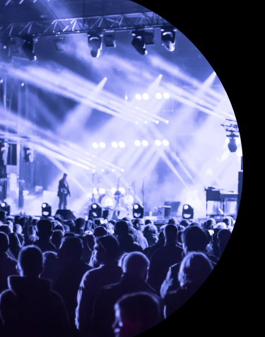
Upon returning from the NAB show in April, I collected my observations and among them was the unmistakable presence of black on the show floor, the likes of which I haven’t seen in my 13+ years of exhibit experience. I’ve been able to walk probably 100 show floors, and while the entire spectrum of color is present on any given show floor, this was different. The default unused graphic space color for many exhibitors is white. Black was nearly equal to if not greater than white in Las Vegas at NAB 2023.
Then I began to realize that I’ve been seeing this color in home design on tv shows, and I even saw black incorporated into home design in ways I never thought about. I recently purchased a home and observed the significant use of black in bathrooms, hallways, ceilings, kitchens in many of open houses and showings. CMG hit the mark on their color trend prediction for Bohld as was evident in Las Vegas.
The exhibits elicited the emotions CMG described were spot on – power moving to new days, serious, joyous and bold.
Here are 3 highly effective uses of Bohld I observed on the show floor that you should give strong consideration to given this marketing trend:
- Fade to black – Utilizing black doesn’t necessarily mean an all in commitment to only that color. I was struck by an exhibit that utilized various tones of pink, magenta and purple which faded to their cantilever ending in black incorporating an LED tile ceiling (yes the ceiling!) of the cantilever. This certainly stood out and commanded attention.
- Black juxtaposed with fluorescent colors – One inspiring exhibit features a predominantly black exhibit with CNC cut letters filled with plexi and backlit with a vibrant yellow on the black wall facing the aisle. This created a beautiful display of brand messaging that enticed attendees.
- Simple, elegant black and white – This works particularly well with brands featuring black and white logos – think Mazda, Apple, Prada, Puma, etc. At NAB a more memorable exhibit was 100% black, no graphics with the exception of a few plexi covered white neon signs. This created a powerful and bold brand image for their exhibit.
Color is important and your brand can certainly benefit from utilizing this color on the show floor. Structure exhibits offers in house CNC cutting, in house graphic design and printing, as well as an abundance of custom lighting options. Don’t be afraid to be Bohld, we can help!
-Ryan Lovell Senior Account Executive, Structure Exhibits
QUICK NOTE
Many people refer to Black as a color. However, what I learned in school and what some folks don’t realize is that black is actually just the absence of light. Unlike other colors, which are created by the reflection or absorption of different wavelengths of light, black is created when no light is present.
In video and film, black (or the absence of light) is very important. In order to create a properly lit space it is always best to start with zero i.e. black. We then add light to our subjects in a “controlled” fashion to promote the finer details we want the viewer to see. In addition, most rigs and trussing within a production space are black in order to hide all the items that are not intended to be seen. In essence, making them NOT stand out.
In design, black is often used in a different way. The default font in any design program is black. It boldly pops off of a white background in the design space. Backgrounds are often black as colored images have a unique way of popping off of them as well. We use black in our own branding as our logo, although all lower case fonts, possesses a more than fair amount of strength because of the contrast.
Black also has the power to control our senses. It has a strong ability to inflict fear upon its viewers or even cause hallucinations in darkness. Alone in a pitch black room, you can almost feel the faint breath of another that is not there. You wonder who is in the room with you and whether they will harm you.
Black is a powerful option when it comes to branding your exhibit. It is extremely versatile and works with just about any color. Just make sure to balance the contrast and do not over utilize it as you can disappear on the show floor in a sea of colorful brands.
A Word(or two) From AI
Black is a timeless color that has been used in design for centuries. It is a color that can evoke a range of emotions and meanings, from elegance and sophistication to darkness and mystery. Black has been used in fashion, art, and design, and its importance cannot be overstated.
In design, black is often used as a base color. It is a versatile color that can be paired with a range of other colors to create a striking contrast or to create a sophisticated and elegant look. Black is a color that can create a sense of depth, and it can also be used to create a sense of balance and harmony.
One of the most important aspects of black in design is its ability to create contrast. When used in combination with other colors, black can create a striking visual impact that draws the eye to the design. It can also be used to emphasize specific elements of the design, such as text or graphics.
In addition to its visual impact, black is also a color that can evoke a range of emotions. It is often associated with sophistication, elegance, and luxury. In fashion, black is often used to create a timeless and classic look, while in graphic design, it can be used to create a sense of modernity and minimalism.
Black is also a color that has cultural significance. In Western culture, black is often associated with mourning and sadness. In other cultures, however, black may have different meanings. In some cultures, black is associated with power and authority, while in others, it may be associated with spirituality and wisdom.
When it comes to using black in design, it is important to consider the context in which it will be used. For example, in a corporate setting, black may be used to create a sense of professionalism and authority. In a more creative setting, however, black may be used to create a sense of mystery and intrigue.
In conclusion, black is an important color in design. It is a versatile color that can be used in a range of contexts to create a range of visual and emotional effects. Whether used as a base color or in combination with other colors, black can create a powerful visual impact that draws the eye and creates a sense of depth and sophistication.